Teach Online
A website to recruit teachers from around the world to teach English online to kids and adults.
UX Design, User Research, User Testing, Prototyping
Research as a strategy for success
As part of Education First’s Global Creative Team, we get the opportunity to act as an in-house agency for our many different EF products. Teach Online, approached us to create a brand identity and a new website. The goal was to grow their online teacher database and increase teacher retention.
The team for designing the website included me as the UX Designer, Lukasz Kulakowski as the UI Designer, and Stefan Hellberg as the project manager.
Research as the strategy for success
Part of the project’s success was using the research generated in the exploration phase during the project’s first month. This fed into the brand strategy and acted as waypoints to ensure that we led with a teacher-first approach.
We used the ‘double diamond’ approach as a framework for the project, to align both team members and stakeholders around the current phase of the project. It also proved helpful with keeping to the timeline.
Our exercises for the exploration phase of the project:

Identifying the pain points
The exercises listed above helped us identify these key pain points for both users and the business.
-

1.
Up to 80% of visitors came from mobile phones, yet they could only apply using a static form on desktop devices.
-

2.
The full application flow from lead to a teacher is deceivingly complex, with 15+ steps, 11 different touch points and takes users more than 3 weeks to complete.
-

3
Data revealed that only 10% of applicants made it to actually teaching, with a 40% no-show rate to the interviews.
-

4.
There is miscommunication that the application process only takes a few days when in reality it can take three weeks or more.
Defining the problem and identifying areas for improvement
We reached out to several teachers currently teaching with Teach Online during our user research to learn about their current experiences, challenges, and motivations. One teacher responded by writing a poem to explain why she teaches English online.
We used this information to flesh out our personas, which guided our next few exercises, including the How Might We’s (HMWs) and content mapping.
Exercises we used for better defining the pain points and opportunities:

A limited scope despite a larger journey problem
Although our research covered the teacher’s entire application process and onboarding into Teach Online, our scope was only to redesign the marketing website. This was frustrating, as we had identified many challenges and areas of opportunity throughout the journey, including too many touchpoints and confusing requirements.

The part of the journey included in our scope

Mapping out the ideal user journey
Focusing on enhancing the marketing website
Even though we couldn’t tackle the entire flow during this project phase, we still wanted to improve the marketing website and use this opportunity to be more transparent and honest with the teachers about the application process and what it’s like to teach with Teach Online.
Brainstorming the How Might We’s, insights and opportunities, and content mapping helped us get our site map and content strategy.
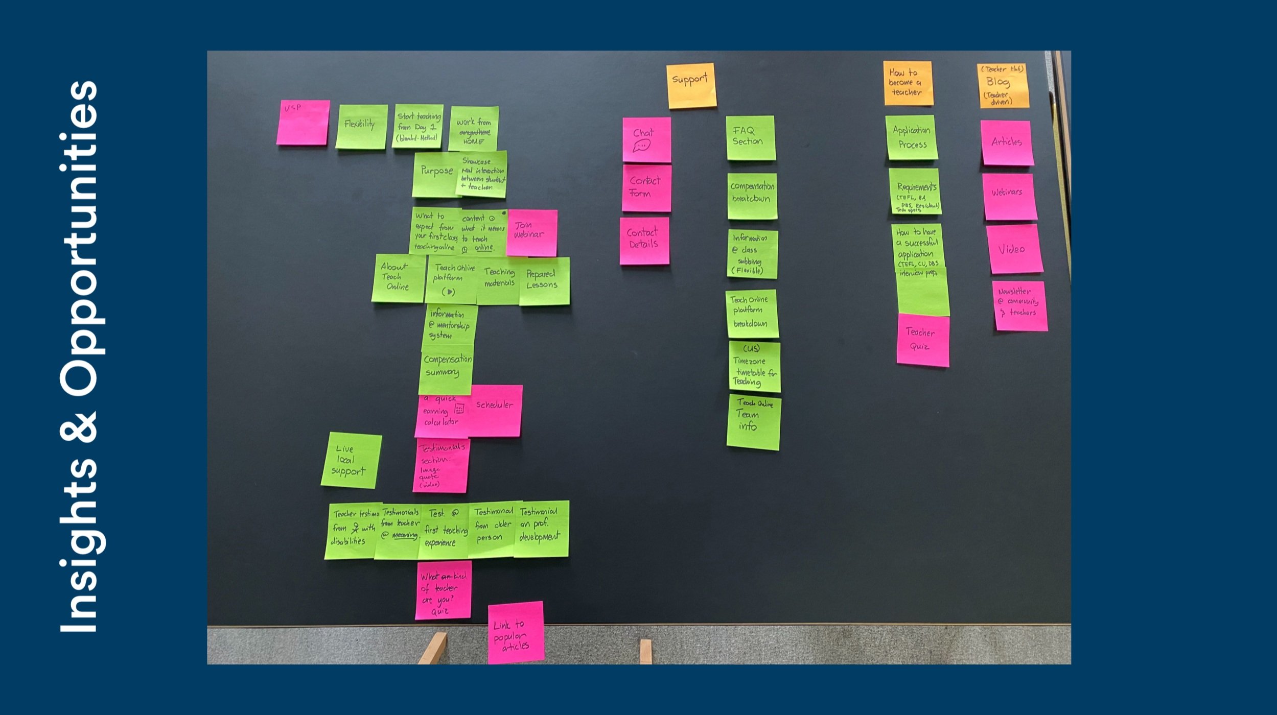
Insights derived from the How Might We's

Mapping the insights to different personas

Mapping the content to different pages in Sketch
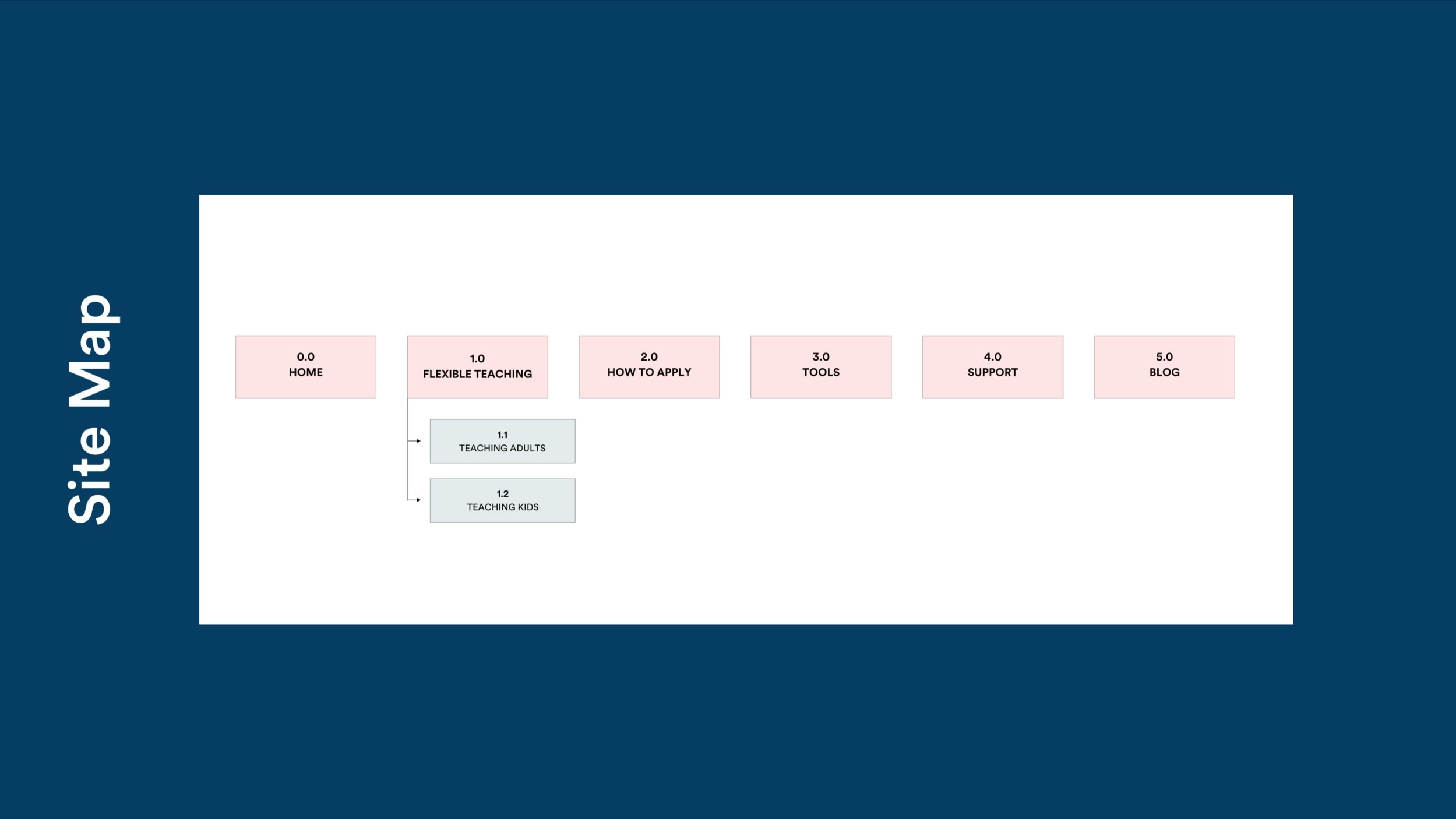
The final site map for EF Teach Online
Exercises we used for better defining the pain points and opportunities:

Simplified and mobile-friendly application flow
Historically, the company has relied heavily on long forms for converting leads. However, we learned that teachers could not apply when using their mobile phones as the application form was only desktop-based. This was despite the fact that around 60% of traffic came from mobile devices.
Leading with a mobile-first approach, we created a simple application flow that would be quick to complete and works well both on desktop and mobile devices.
-
![]()
Choose between kids or adults.
-
![]()
Tell us a bit more about yourself.
-
![]()
Tell us about your teaching experience.
-
![]()
Final step of the application.
-
![thank_you]()
Thank you screen.


Calculator to see potential earnings
We needed to inform the user about teaching kids or adults while providing them with all that information. Teachers get paid a fixed hourly rate for teaching but different rates for teaching kids or adults. Additionally, the hours and the bonuses for each group also varied.
So we designed a calculator to let the teachers compare their potential earnings and hours available for teaching to help them decide whether to teach kids or adults.
The choice to put the teacher first led to more transparency regarding the pricing and teaching options. By providing the teacher with honest benefits of their teaching choices, teaching kids or adults, we put them in charge of their career decisions.
-
![Low fidelity calculator designs.]()
Calculator to compare and calculate potential earnings.
-
![Expanded calculator view]()
The full breakdown of costs and potential earnings.
-
![]()
The final version of the calculator uses a slider.


User testing and design iterations
We conducted remote user tests during the pandemic. We recruited 5 participants who were based in the UK, had a Bachelors Degree and tested on mobile phones. Our key areas of interest were:
Overall impression of the website
Navigation
Understanding teaching requirements
Applying online
Understanding income potential

Click through our prototype on Principle.
Key action points from the user test
-
1.
Split teaching kids and teaching adults onto two different pages to explore each option more in-depth.
-
2.
Demystify the teaching software by including more content around how it works.
-
3
Be more transparent and informative about teaching requirements, and make it easier to find.
Visit Teach Online
See the full brand, UX and UI case studies on Behance and our company website, ef.design. Also, visit the Teach Online website.